Concept and re-design of the Mercedes-Benz Point of Sale System
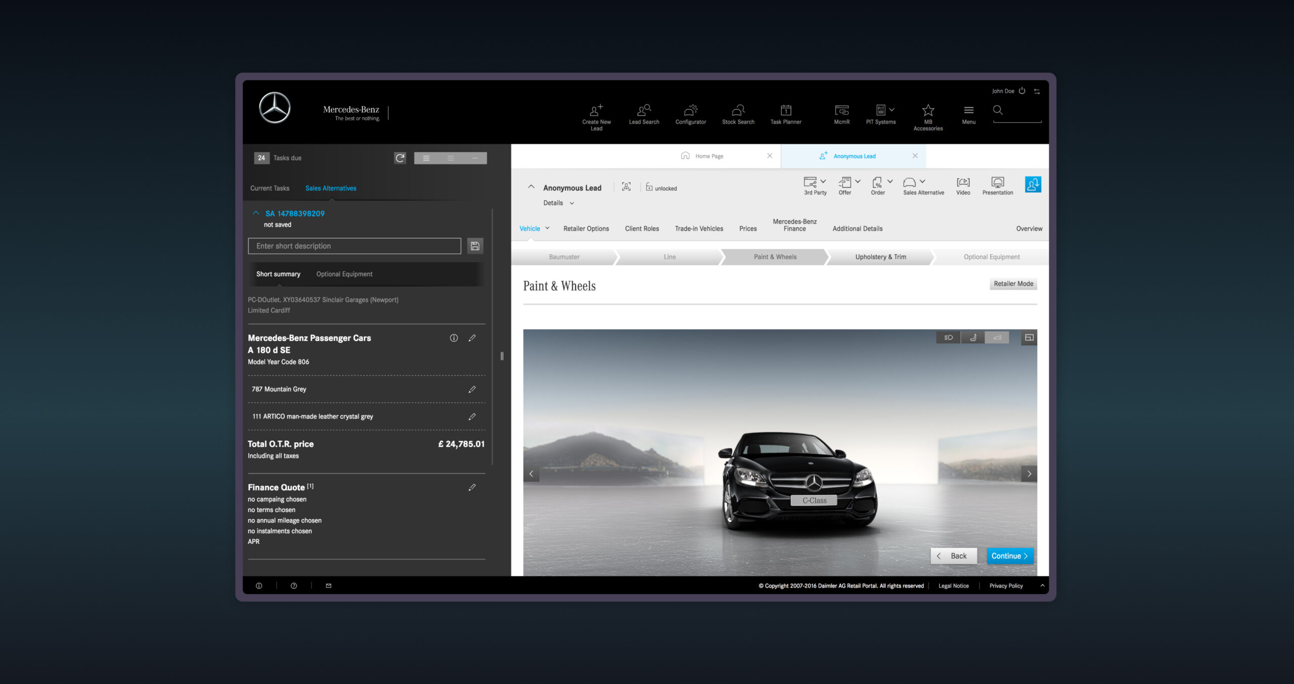
Internationally used web-based Point of Sale System for sales consultants in Mercedes-Benz showrooms to manage leads as well as to configure and order vehicles.
*Client:
Mercedes-Benz
*Agency:
Deutsche Telekom MMS, Dresden & Leinfelden
2015 - 2017
*My role:
Senior UX/UI Designer
*Tasks:
Workshops, User interviews, Concept development, Wireframing, Prototyping, UX/UI Design

The brief
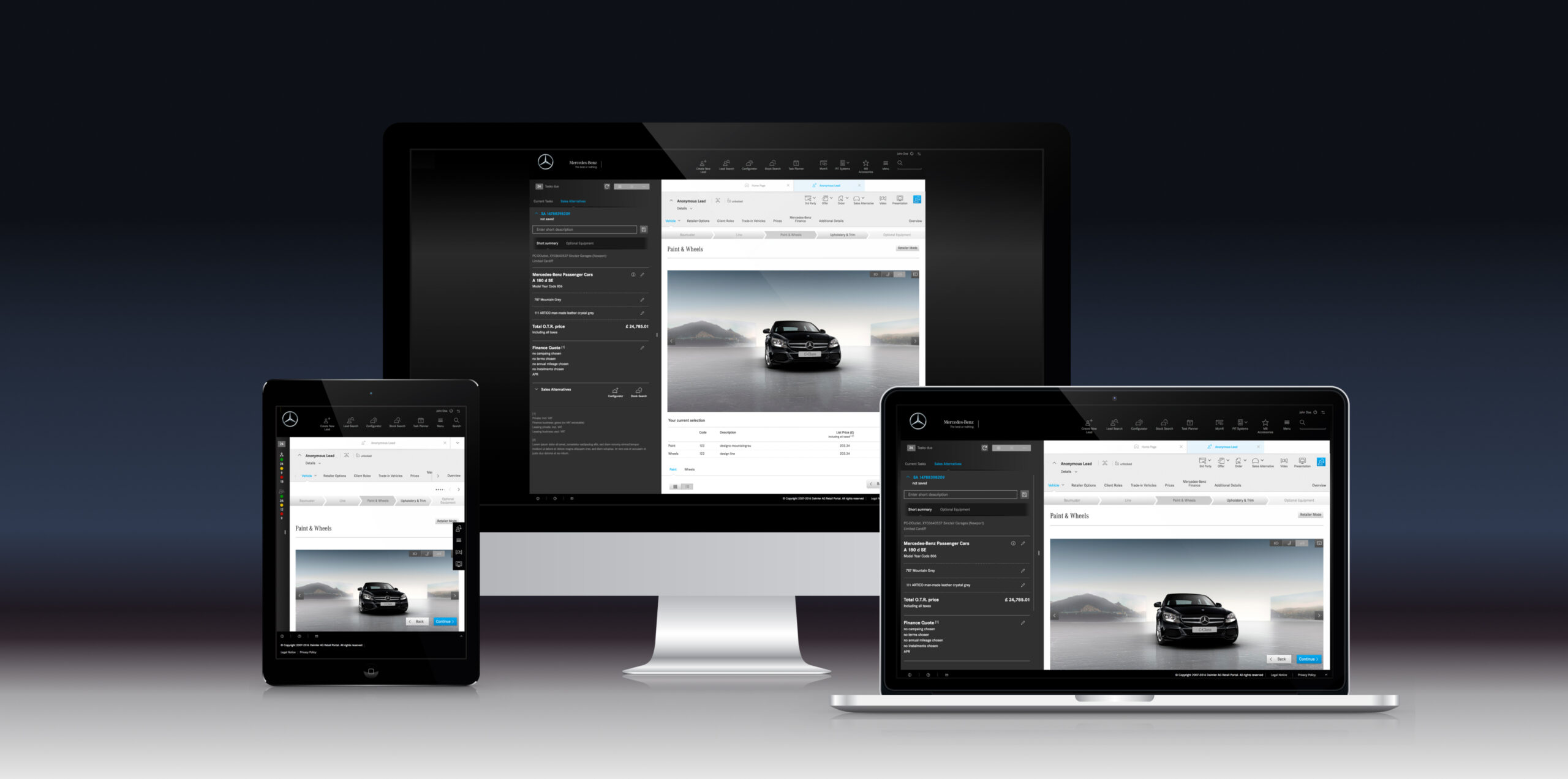
After the brand design update the user interface of the Mercedes-Benz Point of Sale system had to be updated as well. Not only needed it to be responsive but should also include a better usability based on feedback from sales consultants that Mercedes-Benz' headquarter had received.
The challenge
The point of sales system was the key web-based service which combined and held all vital information to process vehicle sales. Therefore the complexity of the system with its dependencies required a comprehensive understanding of the processes as well as how sales consultants worked across different markets.
The approach

*User interviews
Before re-designing the entire interface we conducted user interviews with sales consultants in Switzerland and the U.K. By visiting them on location we gathered useful insights on the way they worked as well as the cultural differences in the OEMs.
*Mapping and prioritising results
We collected, categorized, and prioritozed all feedback and ideas we received uring our interviews. Throughout several workshops we presented all findings, offered high-level solutions and where possible an estimation of amount of work required.
We received a lot of feedback regarding the slow performance of the system as well as the amount of mandatory information that sales consultant had to insert. This resulted in additional time-consuming work load, instead of supporting their work.
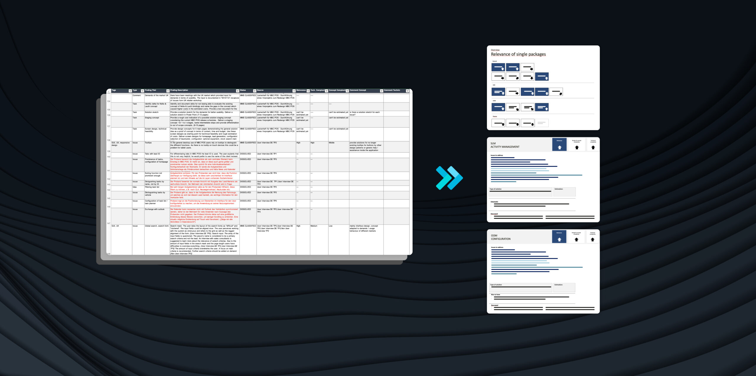
Before starting on a new concept and the re-design we interviewed sales consultants. Meeting, oberserving real users on location once again proved how important qualitative user tests are to deeply understand the user's needs, notice cultural differences, and therefore being able to offer real solutions.
The solution
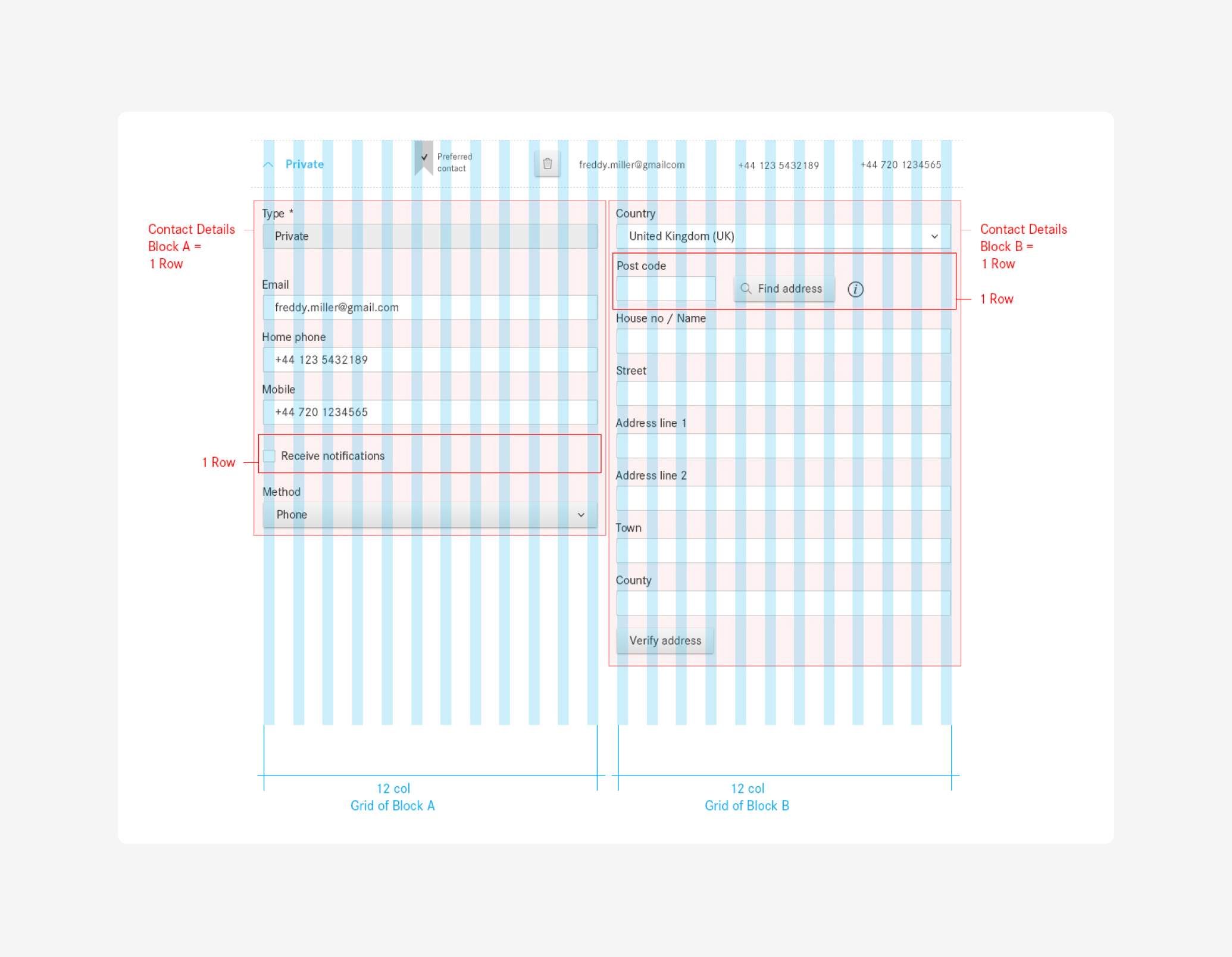
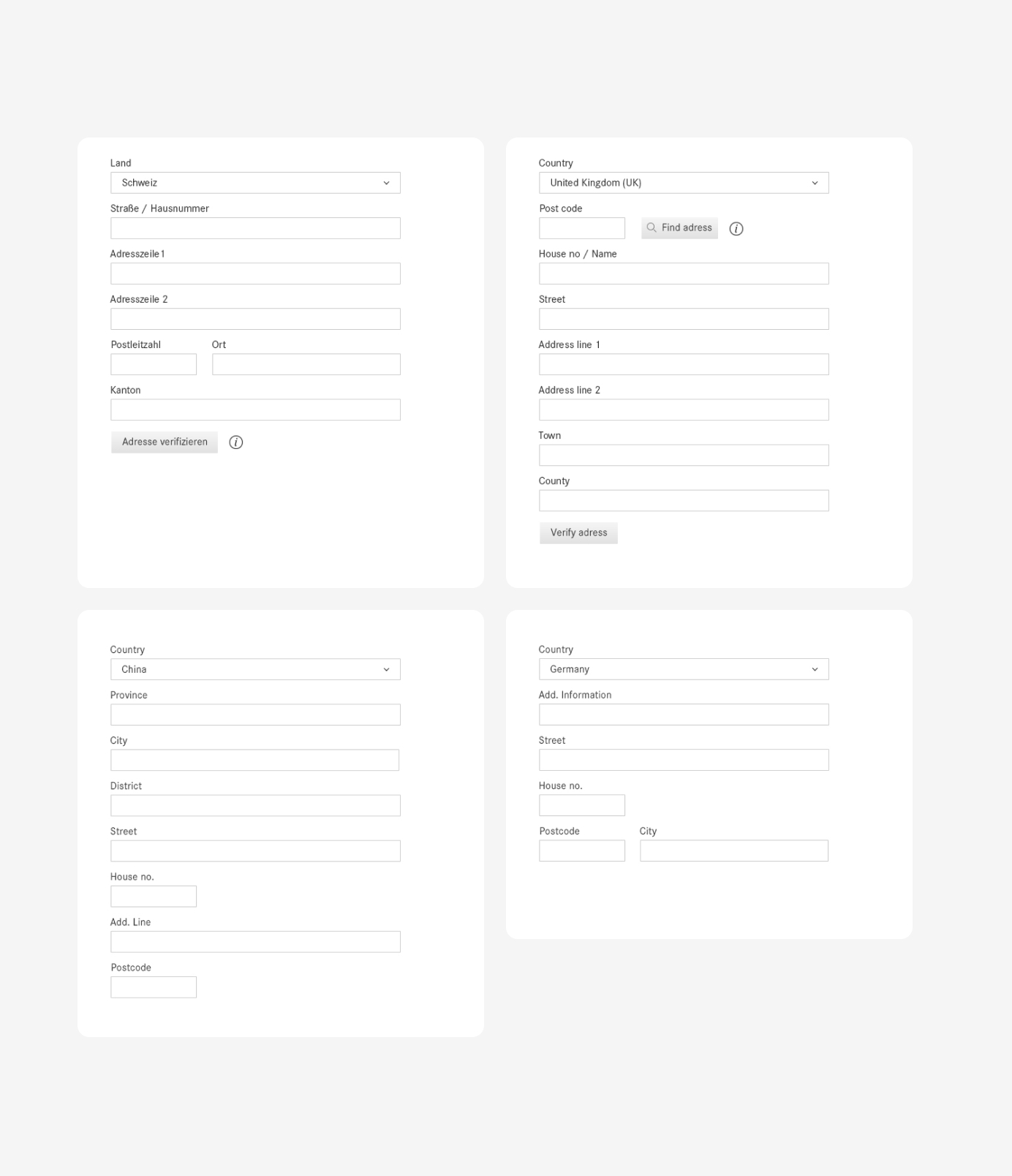
We restructured templates, re-arranged forms to reduce complexity and overwhelm. A close collaboration with the developers supported a comprehensive design system.
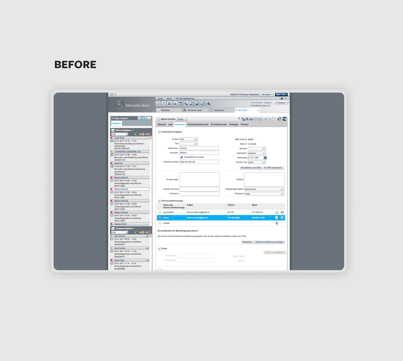
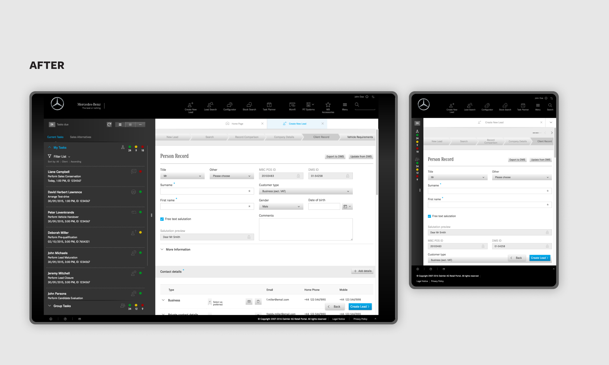
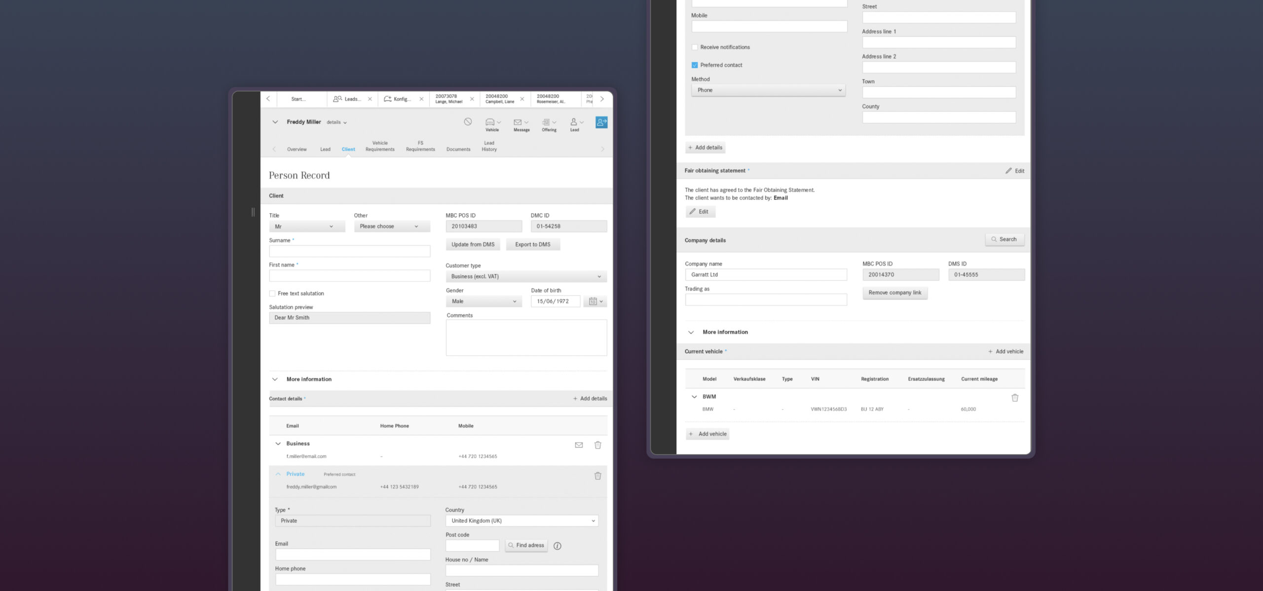
Example: Person Record Form
The structure of the old user interface for collecting customer details felt very cluttered. The sequence of form fields did neither resemble the importance of information nor reflected the reality of a typical conversation with the customer.
Sales consultants said that too much information was mandatory and had to be filled out, which was very time consuming. In addition, customers often weren’t willing to provide all of their personal information in the beginning.
The new concept and UI reflected the reality of a sales conversation by structuring the form into two sections: mandatory/primary and secondary information. By hiding secondary information the complexity of the form was reduced.
