GENESIS ONLINE CHECKOUT
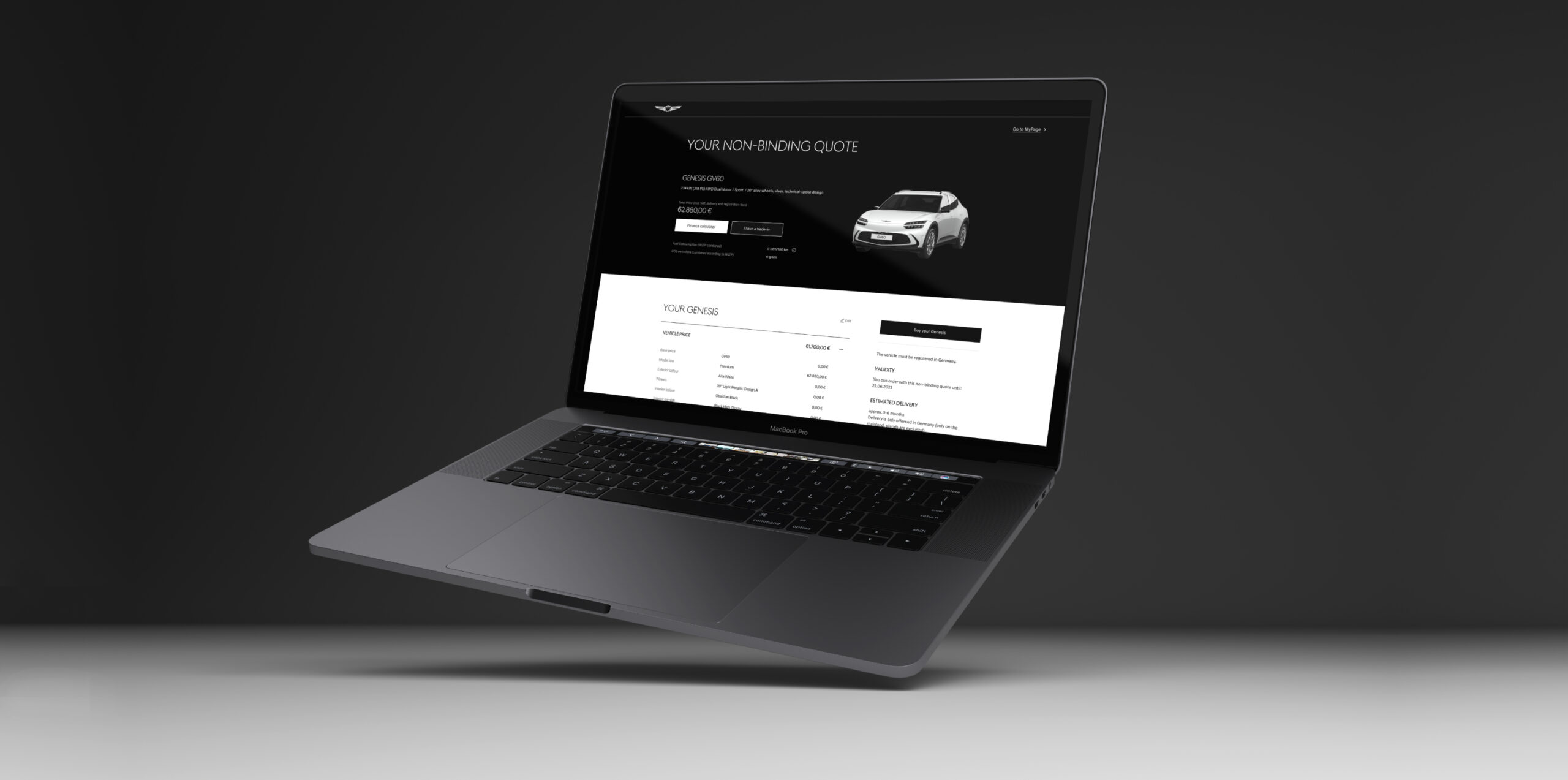
Implementing the process that reflects the new sales strategy from online-only to agency model across the European markets while also improving the user experience.
*Client:
Genesis Europe
*Agency:
Argonauten, Hamburg
2023
*My role:
Lead UX/UI Designer
*Tasks:
Process Flows, Wireframing, Prototyping, UX/UI Design
THE BRIEF
Genesis is Hyundai’s premium brand and has only recently been introduced to the European market where it is competing with well-known brands such as Mercedes-Benz, BMW, and Audi.
As of 2024 Genesis is following an agency model approach in their sales strategy. Therefore, the initial online-only checkout process had to be adapted accordingly.
THE CHALLENGE
A very tight deadline, on-going updates on business requirements, as well as a small team size required a very flexible approach, a holistic view, quick comprehensive thinking, and a deep understanding of all processes.
The different purchasing and financing options for B2B and B2C added another layer of complexity.
THE APPROACH
*Process flows
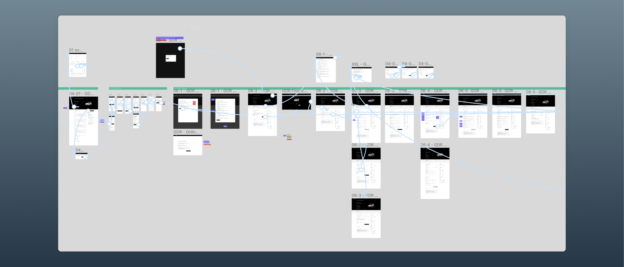
In order to fully understand all purchasing as well as financing options for B2B and B2C customers not just from a technical perspective but also from a user flow one, I created detailed process flows. They served as a basis for all backend developers setting up the requirement documents as well as interfaces. In addition they served as a crucial tool to align the different project teams and various stakeholders.

*Analyzing the customer journey
Due to the time constraints we faced we weren’t able to fully re-design the Genesis online checkout experience for users. We had to find a pragmatic way to analyze the customer journey while highlighting where the agency model had to be implemented.
By using screenshots of the existing UI I found a way to create an easy to understand view of the customer journey. This also helped us find weaknesses in the user experience.
Red dots highlight all mandatory tasks that we needed to focus on, such as agency model relevant modules or missing dialogues that were needed to optimize the user experience. This approach gave everyone in the team as well as the client an overview of our focus and helped us prioritize our tasks.

Collaborating very closely with the client, the backend as well as frontend developers during the entire process, ensured that we maintained our focus on the most important tasks.
*Prototypes as proof of concept
Building high-res wireframes and creating prototypes to showcase the entire customer journey which served not only as a basis for development but also to align with all OEMs.
the overall design.
The solution
Due to the circumstances (tight deadline, budget constraints, team size, changing requirements) we decided upon a 20/80 approach. Instead of re-designing the checkout completely, we prioritized details in the user experience that would have a major impact on the customer not being able to complete the process.
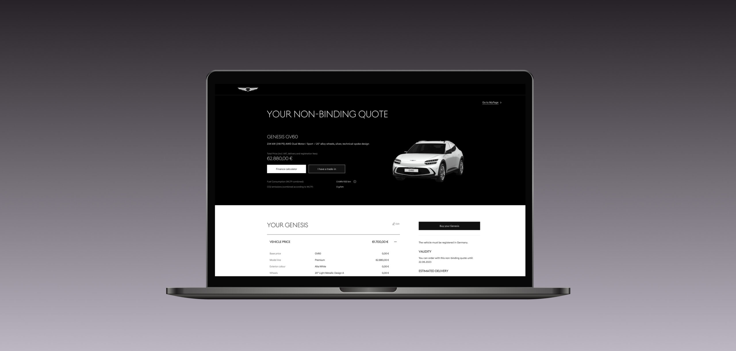
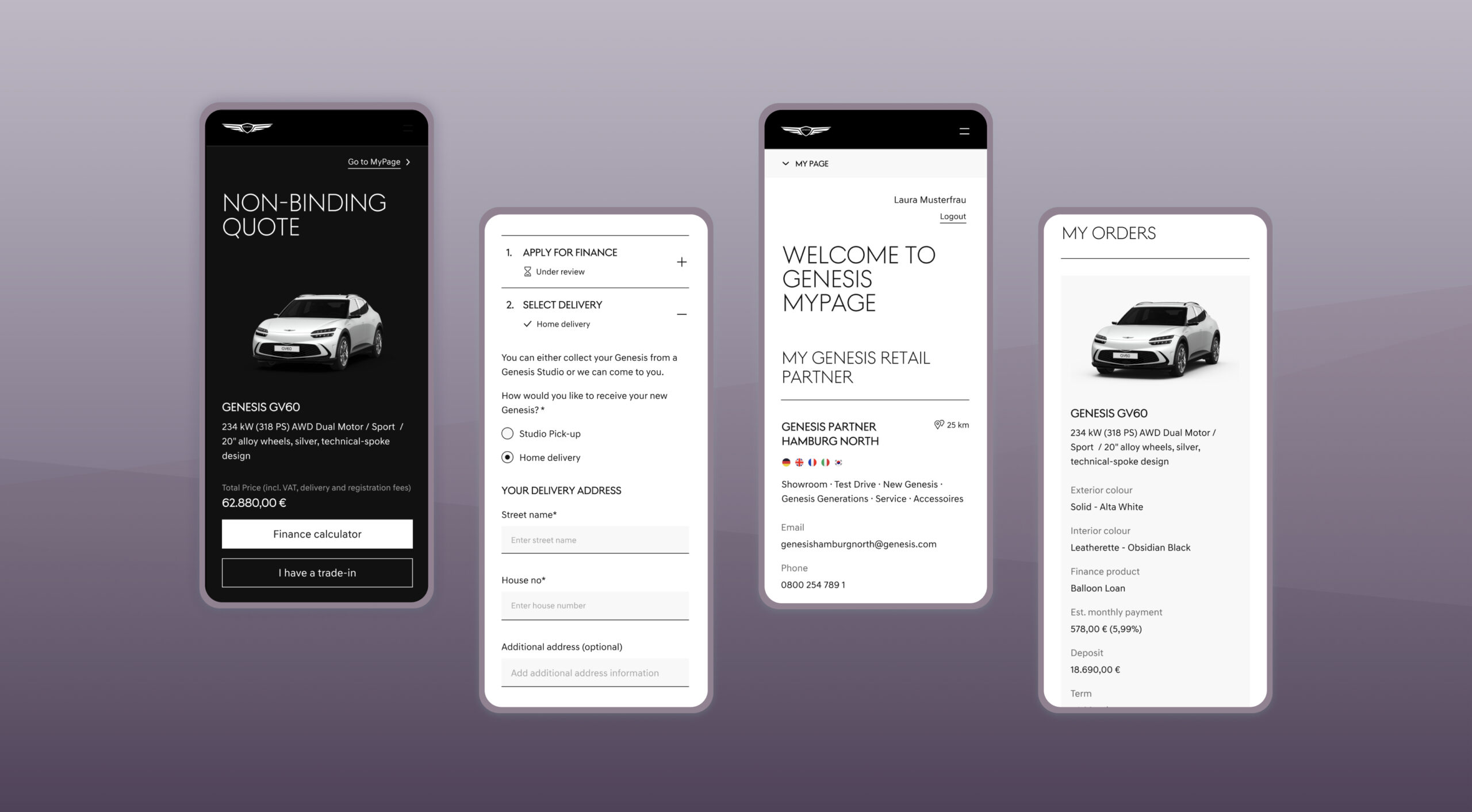
This meant updating the navigation, adding dialogues that helped guide the customer, improved ux writing, and visually tidying up the UI proving more structure and focus on important information as well as interactions.
*Updating the User interface design
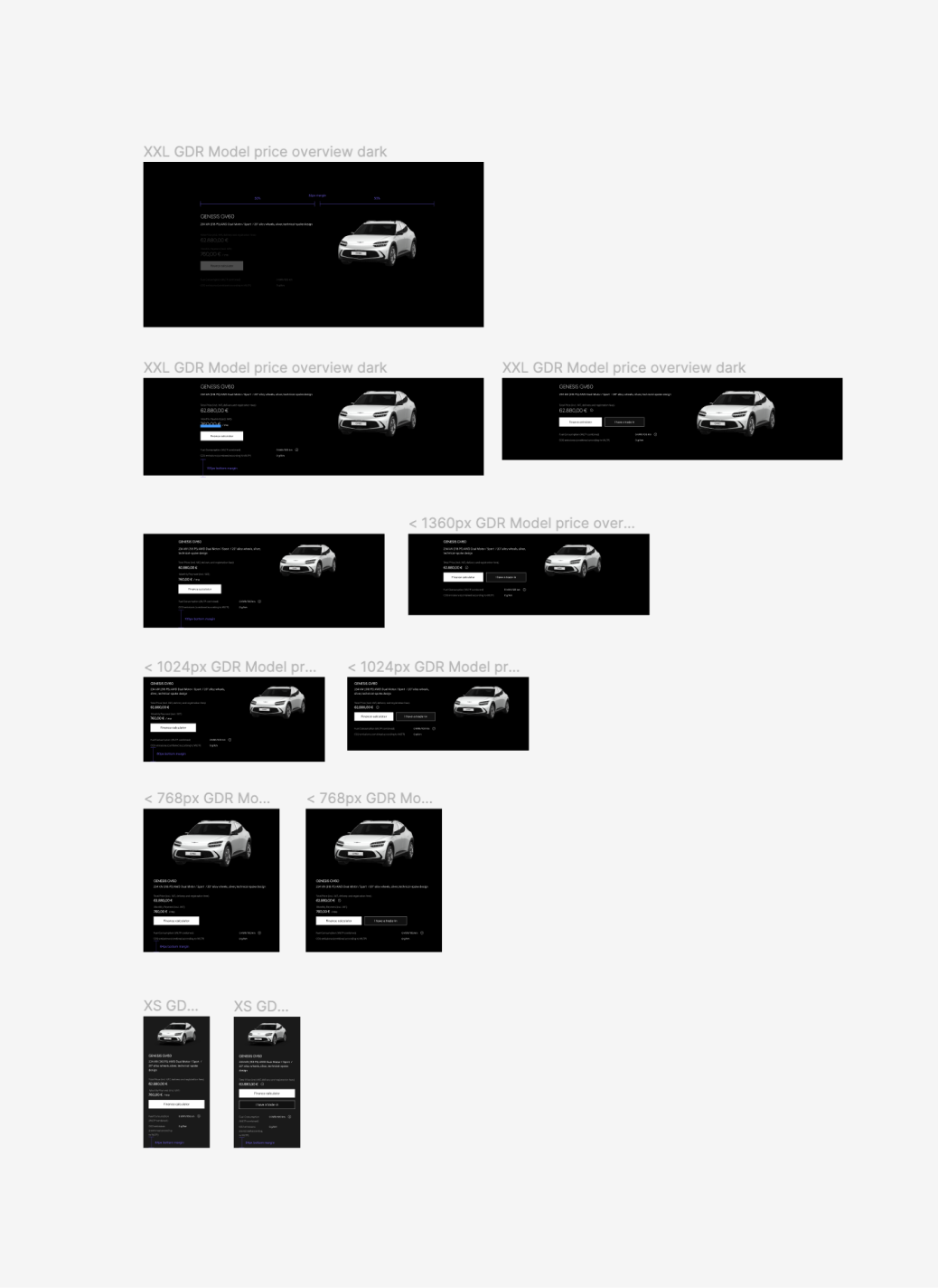
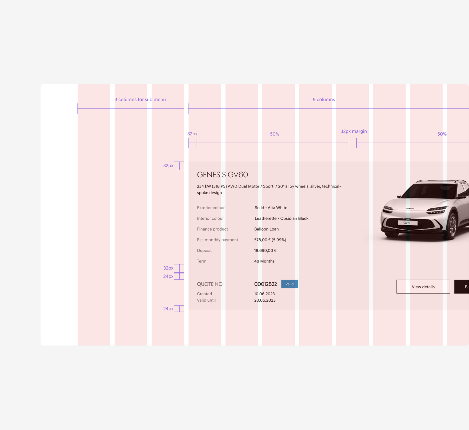
In addition to some structural improvement such as adding dialogues or placements of interaction elements, I aligned the UI of the Genesis online checkout with the brand website’s design. Just by making some visual changes, using a module based approach as well as a design system, the user experience was already improved significantly.
